

Typography
We have a single typeface: Helvetica Now Variable.Helvetica Now Variable is a variable font that gives us lots of room for expression within a single typeface. To keep our new system organized, we’ve created a type specimen that lays out a set of type styles that we use consistently across all of our collateral.
General typographic guardrails
Showcase contrast
- Embrace the variability of the weights and sizes in our type system. Combine type styles so that a range of type styles can be shown off, especially looking for opportunities to combine thick and thin weights. Highlight contrast between styles making sure that there’s significant distance between font sizes and weights.
- Avoid using styles with minimal or low contrast unless with the utmost intention.
- We have lots of header styles to choose from. We don’t have just one single headline style, though there are some styles that lend themselves as natural headline options based on the available space of a canvas.
Minimal and mature
- The overall composition should be in line with our brand tension: minimal and mature.
- This means balancing the overall composition and other design elements: our prismatic stripes, negative space and type hierarchy.
Presentations
- Presentations (decks and posters) use Helvetica Neue
- Weights used are limited to: Light, Normal, Bold
Common type pairings:
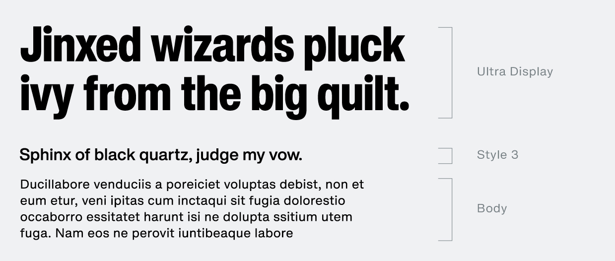
Size hierarchy: Ultra Display + Style 3 + Body
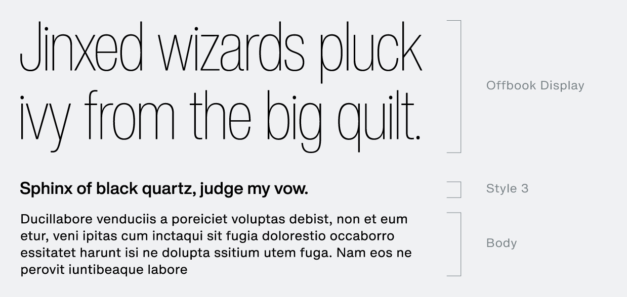
Weight contrast: Offbook Display + Ultra Display

Weight contrast: Style 3 + Style 4

Size and weight contrast: Offbook Display + Style 3 + Body
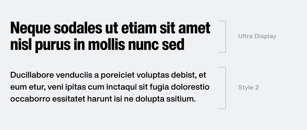
Cover page type pairing: Ultra Display + Style 2
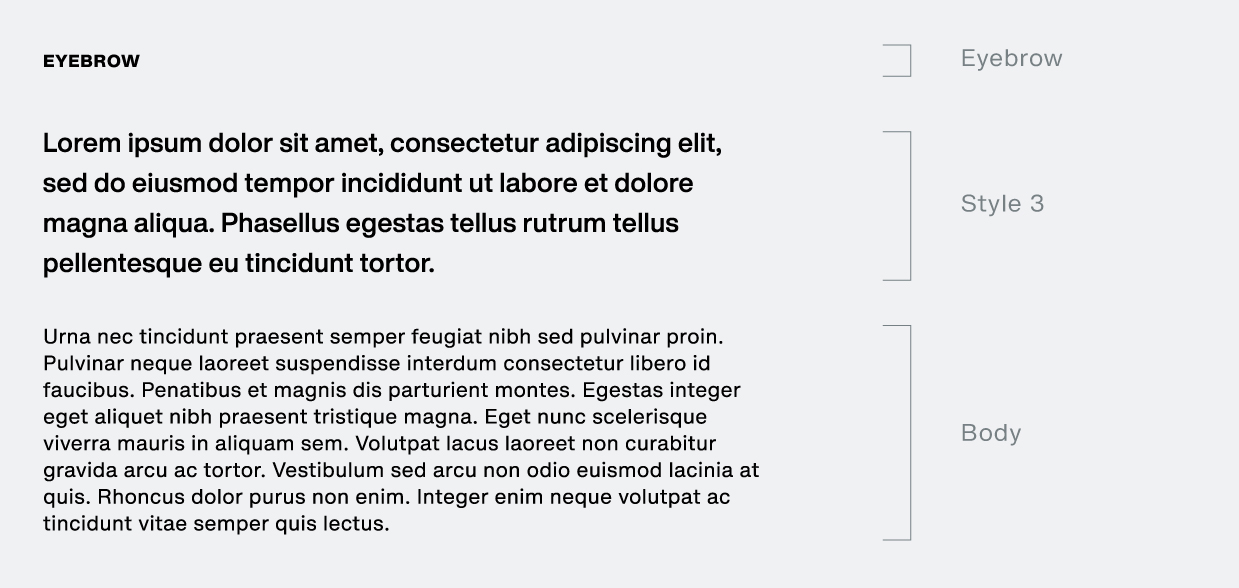
Labeling sections in a long form application: Eyebrow + Style 3 + Body
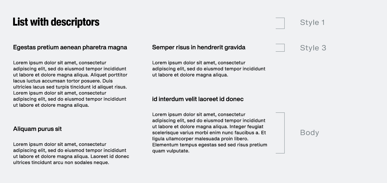
Labeling a long form list with descriptors: Style 1 + Style 3 + Body
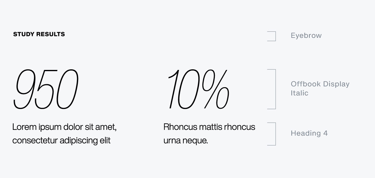
Stat application: Eyebrow + Offbook Display Italic + H4
Quote application:

Apply our type to our grid system
Please see our grid system page for guidance on our typographic layouts.© Copyright Flatiron 2024